
Data inventories and maps - Part 2
By Steven Orpwood, Business Analyst and DPO
July 2018
In my last blog, I talked about 1970s décor and data inventories. In this instalment I’ll be less profligate with my prose and stick to the matter at hand.
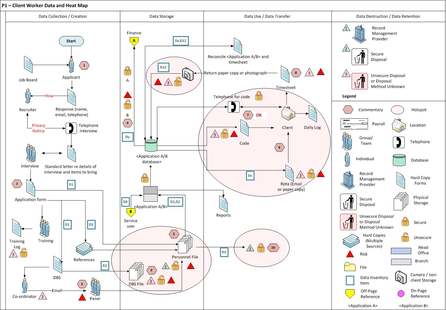
I have described the basic method of creating a data inventory, but highlighted that its use may be limited if we don’t do something with it, and the something I have in mind is a map. There are many kinds of map and they normally tell you about the terrain and possible routes between locations. The map we want is a story about data movements. It can be for an entire business, but it’s more likely that it’s for a particular process, since this is more manageable, unless you have a very large piece of paper…
Our map will have three main components: (i) data inputs; (ii) data storage; and (iii) actions involving the data. I would normally have my paper (physical or virtual) in landscape format and split it into three vertical sections. I then start at the left, with inputs, and move rightwards, putting in storage locations (middle section), and finally what happens with the data on the right. All elements are connected with arrows, which can be one or two way. In comparison to my previous blogs, this one is a little light on humour, but I actually think this is a fun activity, and there’s no need to lighten the mood; you did the hard bit with the inventory, now’s the time to let your hair down and enjoy seeing how it all fits together.
That said, two questions come to mind: (i) is there a tool to do this; and (ii) what do we do with the map. Good questions, even if I do say so myself.
I don’t know about anyone else, but I often assume that there’s a tool to do everything, and data mapping is no different. In fact, there are tools out there, and I’m sure they’re good, but data is a complex thing, not least because it can come from, go to, and be held in, many places. If all your data is online, and you have workflow tools that direct all the processes you complete, I believe that there’s something out there to make your mapping a breeze. However, things are rarely that simple, and my advice is to use a simple diagramming and graphics program to create your maps. Keep it simple as you will need to do the work since the tool is highly unlikely to be able to create the map for you (I’m happy to be proven wrong).
Now, what to do with our map. First off, admire your handiwork. Second, show it to a friend who knows the process well. Third, don’t be disheartened when they point out errors. Fourth, re-draft without moaning. (Repeat steps two, three and four until you are all happy). Now sit down with some relevant stakeholders, e.g. the process owners, IT, compliance, and downstream and upstream users, and decide where things look good, and where there are potential problems. Put a circle around these hotspots and note them in a log for further review, be that a simple risk assessment, a data protection impact assessment, or complete redesign.
Et voilà, you have an inventory, a set of maps (yes, there will be several), and input into your accountability documentation, which will allow your business to plan future projects.
Finally, a data inventory or map, is only good if it’s up to date, so when things change, ensure they are part of the change process.
Now, get mapping…
For more information on Aim’s GDPR services, including training, discovery reviews, interim DPOs and GDPR compliance technology solutions, click here.